Better CSS Drop Shadows for Avada Image Element "Lift-up" animation effects
I was recently working on a client’s website to add a bunch of “buy buttons” for the book she’s about to publish. The site was built for Dr. Heiss by someone else using WordPress and the famous Avada theme. I’m a big fan of the Avada theme (it’s my go-to for new sites these days), but in creating a new page for her, I found a problem/bug/issue with it.
The Problem
I added these buy buttons as image elements using Avada Live aka Fusion Builder. The buttons are transparent PNG images with rounded corners. It’s important to note that those corners are the transparent part of these PNGs.
To match other image buttons on the site, I added the “lift-up” animation effect to the image to give it a little flair when the user hovers over the button. Since these images had rounded corners. That caused a problem:

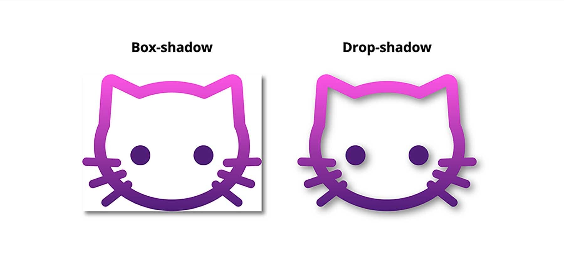
Yep, here’s your problem. Someone set this thing to “box-shadow”.
Avada was using the older CSS rule box-shadow and that rule casts a shadow behind...a box.
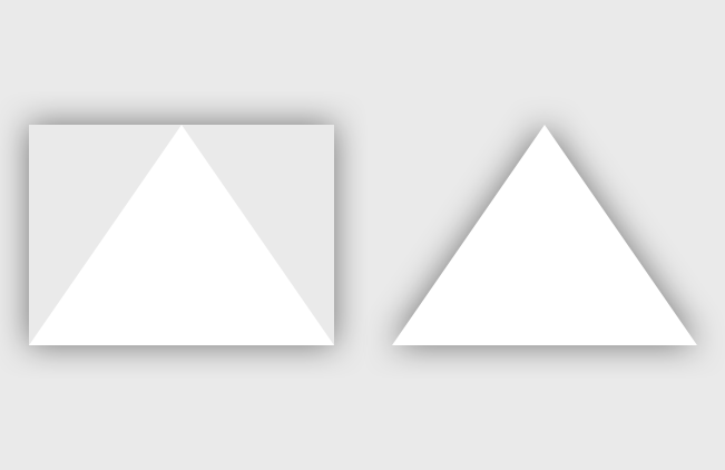
If your element is a rectangle, that's no problem. But if your element has an irregular shape, rounded corners, or anything else that makes it not shaped like a perfect rectangle, the browser will basically draw the smallest box aroundthat element that can containg the element and cast a shadow shaped like that box behind the element. Here's a couple of illustrative images from around the web:

The Solution
So, the solution seems to be to use the newer CSS filter rules. In particular, filter: drop-shadow() renders a nice drop shadow on an element in the way that (I) expect it to, regardless of the shape of that element. It's a more realistic shadow.
To learn more about filter rules and the drop-shadow() filter specifically, head on over to CSS-Tricks.com.
I'll let you read more about this on other sites from authors who actually know what they are talking about, but for quick reference, here are the properties you can set with the drop-shadow() filter:
filter: drop-shadow([offset-x]px [offest-y]px [blur-radius]px color);And an example with real property values:
filter: drop-shadow(3px 3px 10px #333);Only the first two offset properties are required, but you'll also want to set blur-radius and color values to fine-tune how you want your shadow to look.
The color value can be set in hex, using css color words, or, my favorite, rgba() values that allow you to utilize the alpha channel for tranparency.
The Implementation
So in order to fix this issue on my clients site, I needed to figure out how to turn off the box-shadow that the Avada theme was applying and then replace it with a filter: drop-shadow() rule customized to my liking.
First I needed to figure out how to target these elements with custom CSS. I figured that out by hovering over an element and right-clicking to find my browser's "inspect" tool. All major browsers have such tools, but you may have to change a setting or two to enable then.

Right-click over a web-page element to find the “Inspect” tool. The screenshot above shows the how the interface looks in the Brave.com browser, which I use as a more privacy-focused replacement for Google Chrome..
I won't go into how to use the inspect tool to find your element's CSS selectors as there are plenty of other resources on the web that were written by people smarter than me and who did a better job of explaining it.
Once you've figured out your CSS selectors, you can add some custom CSS to your site (WordPress Avada) (Squarespace) to first turn off the box-shadow rule with box-shadow: none !important (Avada recommends using the !important property and I'm going to follow their advice) and then apply the new filter: box-shadow() rule instead:
/*Modify the way the shadow works for the LIFT UP image element animation */ .fusion-image-hovers .imageframe-liftup:before, .fusion-image-hovers .imageframe-liftup, .fusion-image-hovers .imageframe-liftup:before { box-shadow: none !important; } .fusion-image-hovers .imageframe-liftup:hover { box-shadow: none !important; filter: drop-shadow(0px 3px 15px rgba(0,0,0,0.4)) !important; filter: drop-shadow(0 3px 15px rgba(0,0,0,0.4)) !important; }
Voilà!

And animated gif of “before” and “after” screenshots of the drop shadow applied to a rounded-corner image element using the CSS above.
Note that I used both the browser-specific -webkit-filter: and general filter: here in an attempt to get better browser compatibility. I'm not sure that it's necessary for CSS filter rules, now though, as caniuse.com seems to indicate that support is broad in current browsers.
Also, I recongize that that CSS messier then it should be. I’m probably over-selecting my elements and using extraneous rulesets and declarations, but, for now, I know this works for my client and I’m going to leave it alone. I might try to streamline it later. Maybe.
A More General Solution
Note that, more generally, this can be applied to any HTML element with a shadow that doesn’t work right. Once you figure out what CSS selectors are needed to target the element in question (the hard part), you can use the same CSS rules on anything.
Depending on your environment, you may or may not need the !important property in your css. Try it with and without and see what happens.
.drop-shadow { box-shadow: none !important; filter: drop-shadow(1px 1px 1px rgba(0,0,0,0.4)) !important; filter: drop-shadow(1px 1px 1px rgba(0,0,0,0.4)) !important; }
Finally, go check out Rebecca Heiss' new book Instinct at rebeccaheiss.com. It's about learning to understand your instincts, how they can work against you, and how to not only overcome them, but use them to your advantage in business and life.